Unless specified otherwise, dimensions are presented as width × height at their maximum, desktop sizes. These images will resize automatically for mobile and thumbnails.
A “universal” image size you could use in the Homepage Feature Rotator and other featured/hero image uses is 1240 × 535.
Please note this is not a requirement or a rule. It is only offered as a suggestion which may help make generating content and placing it in different areas of your site easier by only needing to create a single image.
This size has been derived from the aspect ratio of the Homepage Feature Rotator while 1240px is the largest width that a featured image may be displayed.
The term “aspect ratio” refers to the ratio of an image’s width to its height. An aspect ratio calculator can be useful for creating an image which serves multiple use cases by maintaining this ratio. For example, the proposed 1240 × 535 “universal” image size is the same aspect ratio as the Homepage Feature Rotator, while also large enough to be used for many other uses described below.
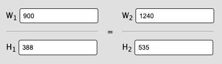
Aspect ratio calculator showing that 1240 × 535 is the same width to height ratio as the Feature Rotator’s 900 × 388
Homepage Feature Rotator
The exact, maximum dimensions of the Homepage Feature Rotators on all sites are 900 × 388. The feature rotator is fully responsive and resizes automatically for mobile while maintaining its aspect ratio. The feature rotator will accept images of any size, and those that do not match its aspect ratio are resized to fit without cropping.
Blog Post/Contest Featured Images
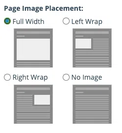
Page Image Placement settings for featured images, showing the options “Full Width”, “Left Wrap”, “Right Wrap”, and “No Image”
A post or contest’s Featured Image is used for its thumbnail in post lists and its main image when shared on social media. When adding a featured image to a blog post, you will be given display options for it on the post itself:
The “Full Width” option displays the featured image above all other content, including the sidebar, and is the largest display option using the maximum content area width of 1240px. This is the most expressive option for big promotions or other feature content.
The “Left Wrap” and “Right Wrap” options insert your featured image to the left or right of the post content. Your content will wrap around the image.
“No Image” allows you to set a featured image to use as the item thumbnail but does not display the image in the content itself. This option is useful for when you want more direct control over the display of content, where you might want to add the image to the content manually in a custom position.
In Blog Post lists and other content lists on the site, items in the list with featured image thumbnails will align automatically and may crop exceptionally tall images. You don’t need to worry as much about matching the width of featured images as you may have on the Frankly CMS.
With the sidebar enabled, the content area of posts and contests is maximum 880px wide.
Event Featured Images
The featured image for events is displayed at a maximum of 880px wide.
Page Featured Images
The featured image for pages is not displayed on the page itself but may be displayed on social media or other locations where the page is shared.
Pages do not have a header by default. You can choose to display the page title or an image using the “Theme” options in the page editor. For the image header, the maximum width is 880px and will be displayed above the content, in line with the sidebar.
Pages may optionally have a “Hero” which allows for a large, expressive header beyond a simple image.
With the sidebar enabled, the content area of pages is maximum of 880px wide. With the sidebar disabled, the content area is maximum 1240px wide.